Linear regression is a technique that is very useful when analysing the trajectory of a stock. In this post I'll show how to compute and render a linear regression trend line.
Contents
Table of Contents generated with DocToc
- Contents
- Getting the code
- Running the code
- What is linear regression?
- Screenshot
- The Excel prototype
- Moving to JavaScript
- Adding the trend line to Highstock
- Visualize linear regression slope over time
- Conclusion
- Resources
Getting the code
Working example code for this post is available to Patrons.
Please show your support on Patreon and I'll give you access to the code and help you get it running.
Running the code
First you'll need NodeJS installed, get the latest version from nodejs.org.
After cloning or downloading and unpacking the code, change to the repo's directory and install dependencies via npm:
cd average-true-range-demo
npm install
Then change into the the client directory and install bower dependencies:
cd client
bower install
To start the server change back to the previous directory and run it using Nodejs:
cd ..
node index
You can now browse to http://localhost:3000 and view the web page.
What is linear regression?
Wikipedia makes linear regression seem rather complicated. Well it is, but let me try and describe it a simple way, even though my explanation probably won't do it it justice.
With linear regression we take a series of data points and fit them to a linear trend line. We can then use the trend line to determine the direction of a stock. The trend forecasts the future value of the stock.
Screenshot
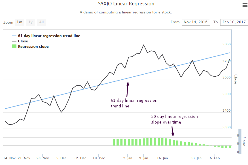
This is what I am aiming at in this post (computed for ASX 200 index):

The Excel prototype
For the code in this post I take an interesting approach. I've prototyped my solution using Excel.
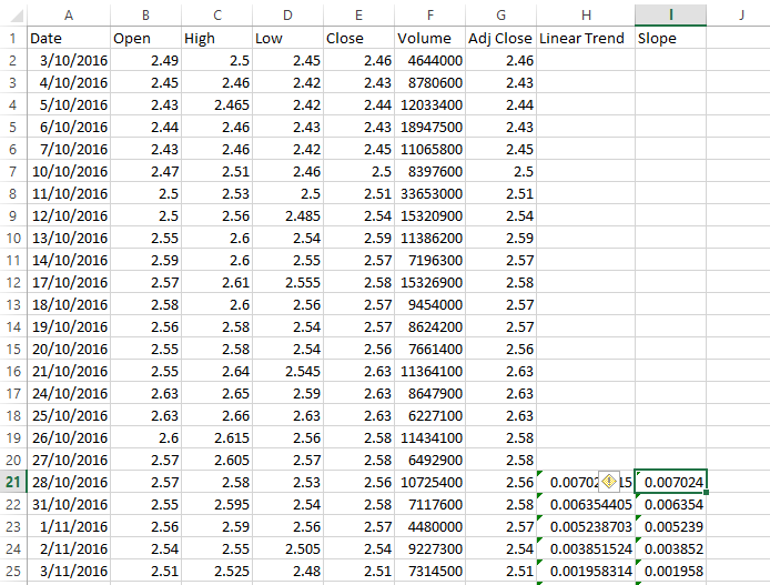
I'm using recent stock data for MPL.AX which looks like this:

In the Linear Trend and Slope columns I'm computing a 20 day linear trend and linear trend slope using Excel formulas. As an example the formula for the slope column looks like this:
=SLOPE(E2:E21, A2:A21)The slope function computes the slope of the linear regression line through the range of data points passed in. This tells us whether the slope is positive (upward) or negative (downward).
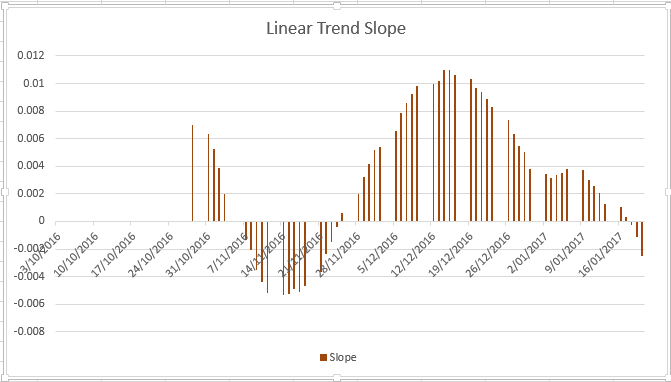
The nice thing about using Excel is that you can easily create a graph of your data:

Moving to JavaScript
So why not just use Excel for the visualization? For two reasons.
First reason: it takes a lot of effort. I need to setup the spreadsheet for every company that I want to view linear regression. As a coder I can set this up with some code so that I can easily switch between companies very quickly (all I have to do is type in the new company name).
Second reason: it's difficult to automate using Excel (VB coders might disagree with me there) and it's automation that I'm really interested in. By automation I mean the ability to make automated trading decisions based off a procedural analysis. Writing this code in JavaScript means I can easily move the code into my automated investment pipeline.
To move from Excel prototype to JavaScript I use Formula.js. This allows me to use the Excel functions in JavaScript so I can easily go from Excel to working JavaScript code.
I acquire my data from the Yahoo financial API as shown in my earlier blog post.
I already have my data in a Data-Forge dataframe, so I extract it and pass the values to SLOPE and INTERCEPT functions:
var closeSeries = dataFrame.getSeries('Close');

var closeValues = closeSeries.toArray();
var closeIndicies = closeSeries.getIndex().select(date => date.getTime()).toArray();

var firstTime = closeSeries.getIndex().first().getTime();
var lastTime = closeSeries.getIndex().last().getTime();

var linearSlope = formula.SLOPE(closeValues, closeIndicies);
console.log('linear slope: ' + linearSlope);

var linearIntercept = formula.INTERCEPT(closeValues, closeIndicies);
console.log('linear intercept: ' + linearIntercept);

With the slope and linear intercept values I can compute the linear regression values for at the start and end of my time series data:

var firstLinearValue = linearIntercept + (linearSlope * firstTime);
var lastLinearValue = linearIntercept + (linearSlope * lastTime);
Adding the trend line to Highstock
With the dates at the start and end of my time series and having computed the linear regression values for these dates, I can easily add a linear regression trend line to my Highstock chart:
{
    type: 'line',
    name: totalDays.toString() + ' day linear regression trend line',
    data: [
        [firstTime, firstLinearValue],
        [lastTime, lastLinearValue]
    ],
    marker: {
        enabled: false
    },
    states: {
        hover: {
            lineWidth: 0
        }
    },
    enableMouseTracking: false,
},
For more on Highstock please see my earlier blog post.
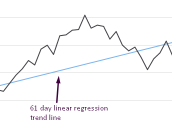
This produces a trend line that looks as follows (computed for ASX 200 index):

Visualize linear regression slope over time
What's really useful is to make use of the linear regression over time. Using this I can tell on any given day whether the outlook for a stock is positive (trending up) or negative (trending down).
So I create a function that computes a time series for the linear regression slope of the stock price:
//
// Compute linear regression for the series.
//
var computeRegression = function (series) {

    return series
        .rollingWindow(regressionPeriod)
        .asPairs()
        .select(function (pair) {
            var window = pair[1];
            return [
                window.getIndex().last(),
                formula.SLOPE(
                    window.toArray(),
                    window.getIndex()
                        .select(function (date) {
                            return date.getTime();
                        })
                        .toArray()
                )
            ];
        })
        .asValues();
};
I add this time series as a second Y axis to the chart:
{
    labels: {
        align: 'right',
        x: -3
    },
    title: {
        text: 'Slope'
    },
    top: '80%',
    height: '20%',
    lineWidth: 10
},
Using the regressionSeries function I compute the new series from the stock prices and add it as a series to the chart, attaching it to the second y axis:
{
    type: 'column',
    name: 'Regression slope',
    data: computeRegression(closeSeries).toHighstock(),
    id: 'regresssionSlope',
    zIndex: 1,
    yAxis: 1,
},
The result looks like this:

I decided to plot this as a histogram so that I could easily see if the result was positive or negative for any given day on the chart.
Conclusion
Thanks for reading my post about linear regression. If there is anything that needs further explanation please comment below.
Resources
Formulajs: https://github.com/sutoiku/formula.js/